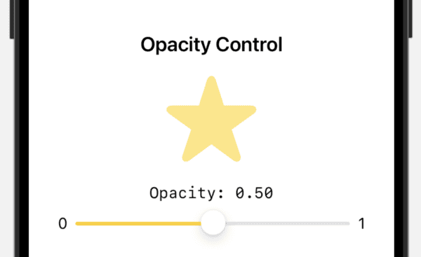
The Slider has been around in iOS since the beginning. Apple included it in the SwiftUI framework beginning with iOS 13. The slider is a simple UI control that allows you to slide your finger across the screen and update a value behind the scenes. The last time I wrote about it was about 12 years ago demonstrating it with Objective-C code and a Storyboard. It’s time to provide a more current example.