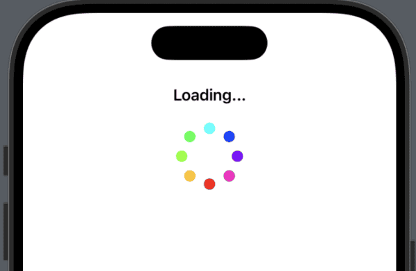
The SwiftUI framework provides the tools you need to create the layout of your app. Two of these are the Spacer and Divider, both of which are views as they conform to the View protocol.

Learn How to Create iOS Apps
The SwiftUI framework provides the tools you need to create the layout of your app. Two of these are the Spacer and Divider, both of which are views as they conform to the View protocol.
SwiftUI views work with view modifiers that make it really simple to create great effects. In this tutorial, we’ll look at making a rounded profile picture that you might use on a profile page in your app.
This particular profile picture (not me), is created with an Image view with several view modifiers to clip the corners to make a circle as well as add a small border around it. The result looks surprisingly good.
Parse.com was a MBaaS that shut down in 2017 and became Parse Platform, which is now an open-source version with a thriving community. It is a backend framework for mobile and web applications that you can install on a server and host yourself.
I first started using Parse when it was new, I believe around 2012/2013 on a project building an iPad app for time tracking at various locations on the west coast of the USA.
[Read more…]Context menus provide a simple way of displaying additional actions in response to a long-press on a View item. Some items in your view might require more options, but rather than cluttering a menu or the View with these options, they can be grouped together in a contextMenu.
In this tutorial, we’ll add Buttons to a NavigationStack toolbar and position them correctly according to your needs. To demonstrate what can be done, we’ll add animations to the buttons based on the SF Symbols tutorial.
Apple’s SF Symbols is a large amount of scalable icons that integrate with SwiftUI. The library has over 6,000 icons ready for you to use in your iPhone app.
Symbols come in nine weights and three scales, automatically align with text, and can be exported and edited using vector graphics editing tools to create custom symbols with shared design characteristics and accessibility features.
To help you find symbols to use in your app, Apple provides the SF Symbols app that you can download to a Mac to browse through the library. You can find details here.
In this tutorial we’ll look at how to use symbols and how to modify characteristics to suit the look and feel of your app.
[Read more…]The pull-to-refresh gesture has been around since the early days of the iPhone when Tweetie launched in around 2008. It provided a way for a table view to refresh by swiping down to a point where the refresh was triggered.
Apple introduced it in the UIRefreshControl class in iOS 6. In iOS 15 in 2021, Apple added support natively to SwiftUI.
It is now known as refreshable and is an instance method in the View. Lets take a look at how it works.
[Read more…]In iPhone apps, there comes a time when you might need to show an alert to a user to ask them for input. Apple provides the alert instance method on a view for you to use. This particular instance method is for iOS 15 and later. Here is how you use it:
struct ContentView: View {
@State private var showAlert = false
var body: some View {
VStack {
Button("Show Alert") {
showAlert.toggle()
}
.alert(
"Important Message", // Title of the alert
isPresented: $showAlert, // Binding to show the alert
actions: {
Button("Allow") {
// Action when "Allow" button is pressed
print("User pressed Allow")
}
Button("Don't Allow", role: .destructive) {
// Action when "Don't Allow" button is pressed
print("User pressed Don't Allow")
}
},
message: {
Text("Do you want to allow this action?")
}
)
.padding()
}
}
}
In this tutorial we’ll be looking at how to create your own custom button style. Although SwiftUI does provide great default styles, many apps use their own style to match the unique design of their app. This can be accomplished with the ButtonStyle protocol that allows you to chose different effects from colours to shadows and then apply the style across all Buttons in the app giving a consistent style that can easily be altered if needed.
First, create a struct that conforms to ButtonStyle:
struct CustomButtonStyle: ButtonStyle {
var buttonColor: Color?
var shadowRadius: CGFloat?
func makeBody(configuration: Configuration) -> some View {
configuration.label
.padding()
.background(Color(buttonColor ?? Color.blue))
.foregroundColor(.white)
.cornerRadius(10)
.shadow(radius: shadowRadius ?? 0)
.scaleEffect(configuration.isPressed ? 0.95 : 1.0)
.animation(.easeInOut(duration: 0.2), value: configuration.isPressed)
}
}
In this code, we have two optional variables that allow us to either take a colour parameter and radius parameter, or just let the custom button set to defaults.
The makeBody method defines the visual appearance and behaviour of the button. Here you can set what it will look like. makeBody is required by the ButtonStyle protocol, so must be implemented.
[Read more…]SwiftUI is great for creating views for your iPhone application, but sometimes you need UIKit to fill some gaps. UIViewRepresentable provides a way to bridge the gap between UIKit and SwiftUI by wrapping a UIKit view and allowing you to use that view in SwiftUI.
I recently wrote about bringing Writing Tools to SwiftUI, but as mentioned in that tutorial, SwiftUI is limited and only brings a small part of the available features. The only feature available to a TextEditor in regards to writing tools is .writingToolsBehavior.
In this tutorial, we’ll look at how to bring a UIKit view into SwiftUI.
[Read more…]